 |  | ||||
|
WRITINGS CARTOONS ANIMATIONS and VIDEO BACK |
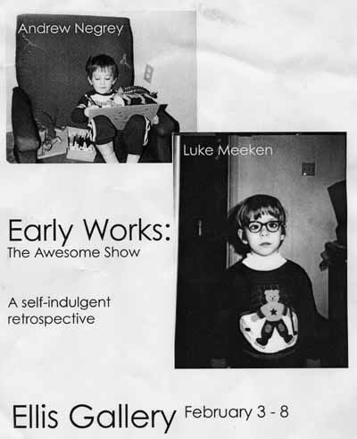
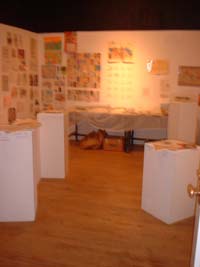
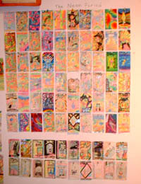
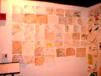
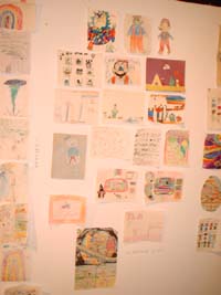
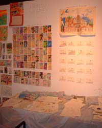
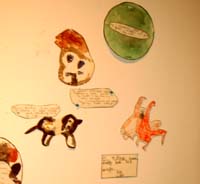
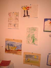
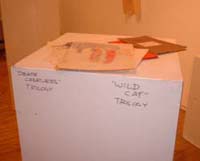
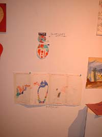
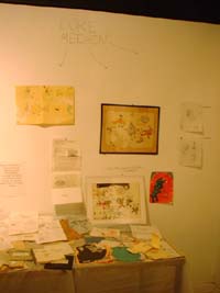
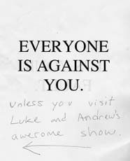
Carnegie Mellon's esteemed College of Fine Arts has a wide variety of display opportunies for its talented young éléves to stick their work for people to look at it. One of these areas is the Ellis Gallery, a small, one-room gallery area in the art building which is usually the locale of most people's first big shows and exhibitions. My colleague Andrew and I made it the location of our first AWESOME show and exhibition. Andrew and I had spent a significant portion of first semester sophomore year (when we weren't staying up 'til five AM making ridiculous Beatles-esque animations, debating the aesthetic sensibilities of Super Mario Bros., or making proposals to extract a cube of prime creation matter from God's torso...) discussing how much better we were at being artists when we were in and below fourth grade. No obscure conceptual art, visibly lacking craftsmanship, or clumsy attempts at postmodernism plagued our creations when all we wrote and drew focused on themes of Nintendo, dinosaurs, aliens, dinosaurs, fictional baseball teams, and dinosaurs. So we decided to put up the most awesome show we possibly could in the Ellis: an exhibition of our artwork and writings from ages 0-11. I managed to slog a couple piles of my Awesome stuff up fom home, and Andrew's dad managed to bring up copious amounts of Awesome stuff for the show (unfortunately the schedule of my mom and myself wasn't as flexible, and I couldn't bring up quite as much of my old art, but the show still turned out fairly evenly). We reserved the space a semester in advance, but, thanks to the CFA office's "Where's Waldo" policy of notifying students of their gallery schedule, we weren't notified that we had been succesfully given a slot until the day before the day before we were supposed to set the thing up. And that notification had come from a freshman who noticed our names on the small, unobtrusive piece of yellow paper posted on the wall near the office. Luckily we had brought all of our Awesome artwork up in advance, partially because we are amazing plansters, but mainly because we both wanted to see each other's Awesome artwork so much. The show got put up fairly swiftly. We bisected the room, and stuck our stuff up all over our own sides. In the end, it was a little off balance; my side had alot more writing and pre-k through third grade, Andrew's had more drawings, and had some more third-through-fifth-grade work. But any discrepancy was irrelevant: it was all Awesome. As it turned out, our little excursion into insane self-indulgence wasn't solely pleasing to ourselves. We got a lot of Awesome comments from our Awesome professors who saw the show, and even got some great stuff written on our comments sheets: comments sheet 1comments sheet 2 comments sheet 3 comments sheet 4 comments sheet 5
|
